
FEST FRIEND | UX/UI Case Study
The Vision: Music festivals are peak human experiences, but they are also logistical nightmares. Fest Friend is a mobile app concept designed to eliminate the anxiety of "the lost friend" and the "missed set." The goal was to build a tool that feels like a safety net, allowing users to stay present in the music while staying connected to their group.
The Problem: In high-density crowds, traditional GPS is laggy, cell service is spotty, and schedules are hard to track. Festival-goers need a low-friction, high-contrast interface that works when they are tired, distracted, and on the move.
Project Details
Role: Lead UX/UI Designer & Brand Strategist
Tools: Figma, Photoshop, Illustrator
Focus: User Persona Development, Interaction Design, Visual Identity
Strategic Execution
1. User-Centered Research We began by developing User Personas ranging from the "First-Timer" who needs constant navigation help to the "Festival Pro" who just wants a streamlined schedule. This research led to a "Safety-First" UI, prioritizing the "Find My Friends" and "Emergency SOS" features in the thumb-zone for one-handed use.
2. Visual Identity: Playful yet Functional The branding needed to match the high energy of a festival without sacrificing legibility.
The Palette: High-contrast neons set against a deep "Night Mode" background to ensure screen readability in both direct sunlight and strobe-lit stages.
The Vibe: A playful, rounded design system that feels approachable and "human" rather than clinical or overly techy.
3. Interaction & Wayfinding
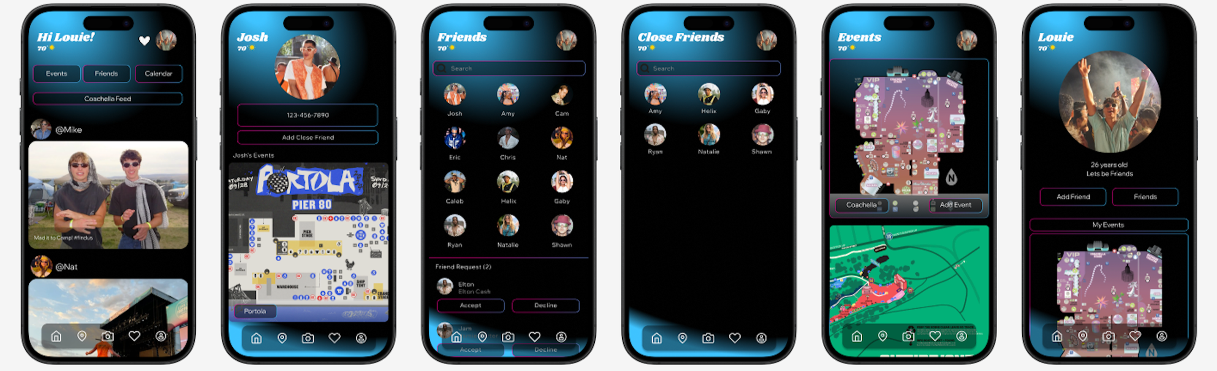
Dynamic Map Integration: Simplified, low-data maps that prioritize key landmarks (water stations, bathrooms, and stages).
Personalized Schedulers: A collaborative scheduling feature where friends can vote on sets and see where their group will be at any given time.
Key Contributions
End-to-End Prototyping Developed a high-fidelity Figma prototype featuring a seamless onboarding flow and intuitive navigation.
Branding & Iconography Created a custom set of Festival Icons for wayfinding, ensuring the visual language was consistent across the entire app.
User Flow Optimization Reduced the "clicks-to-action" for the most critical features (Location Sharing and Schedule Access) to under three taps.
Core Takeaways
Design for Reduced Cognitive Load In a festival environment, users are overstimulated. The UI must be invisible - getting the user the info they need as fast as possible so they can put their phone back in their pocket.
The Power of Personas Building for specific types of festival-goers helped us realize that Social Connectivity was a higher priority than Artist Discovery.
Collaborative Utility A successful social app isn't just about the individual user; it’s about how the app facilitates group dynamics in a physical space.
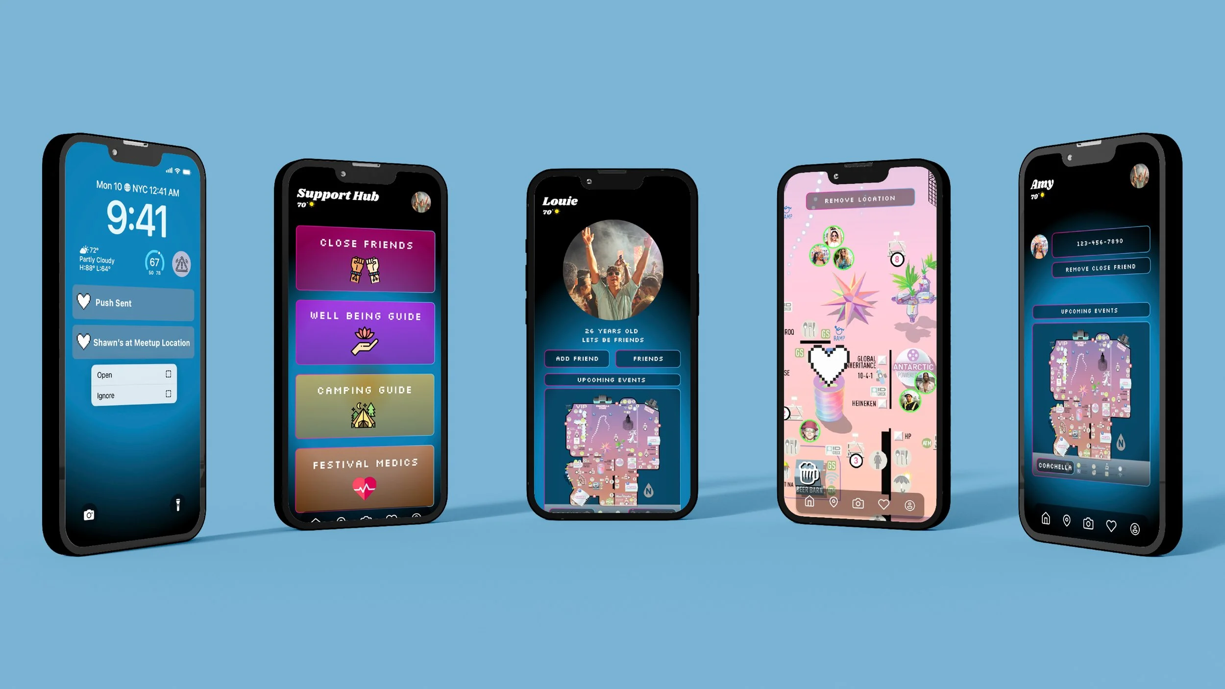
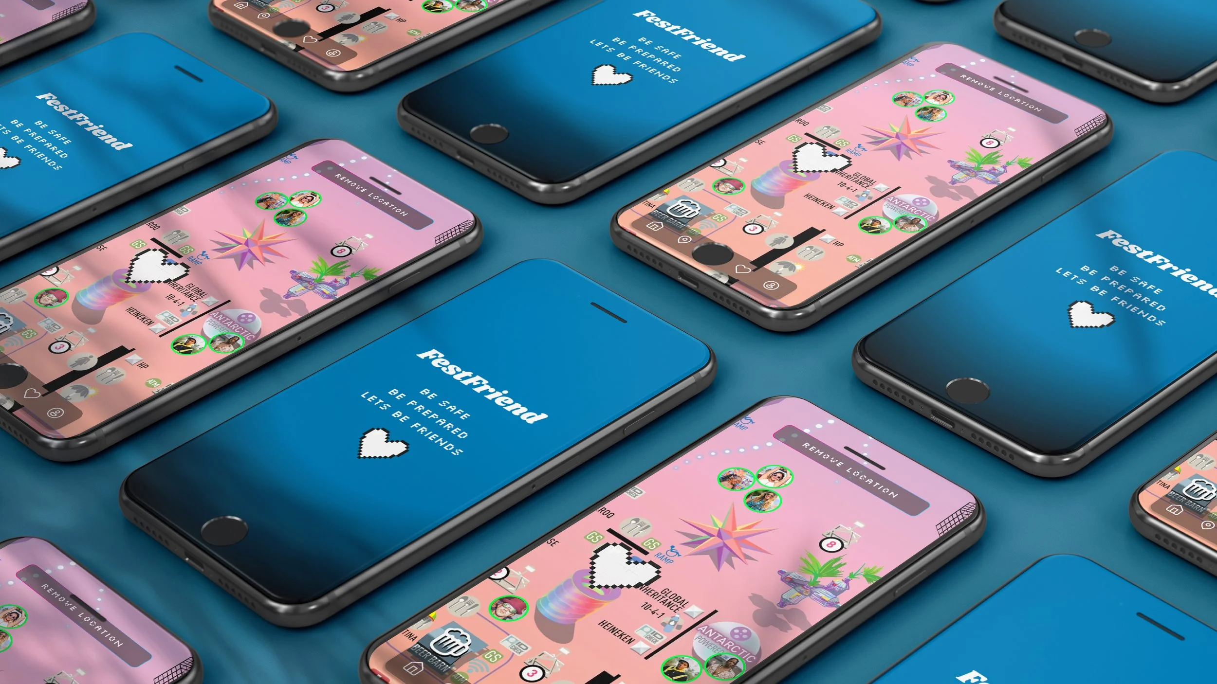
Mapping
The map enables users to see friends’ real-time locations, drop custom meetup pins, and navigate with a built-in compass, creating a simple, engaging way to connect and coordinate at busy events.

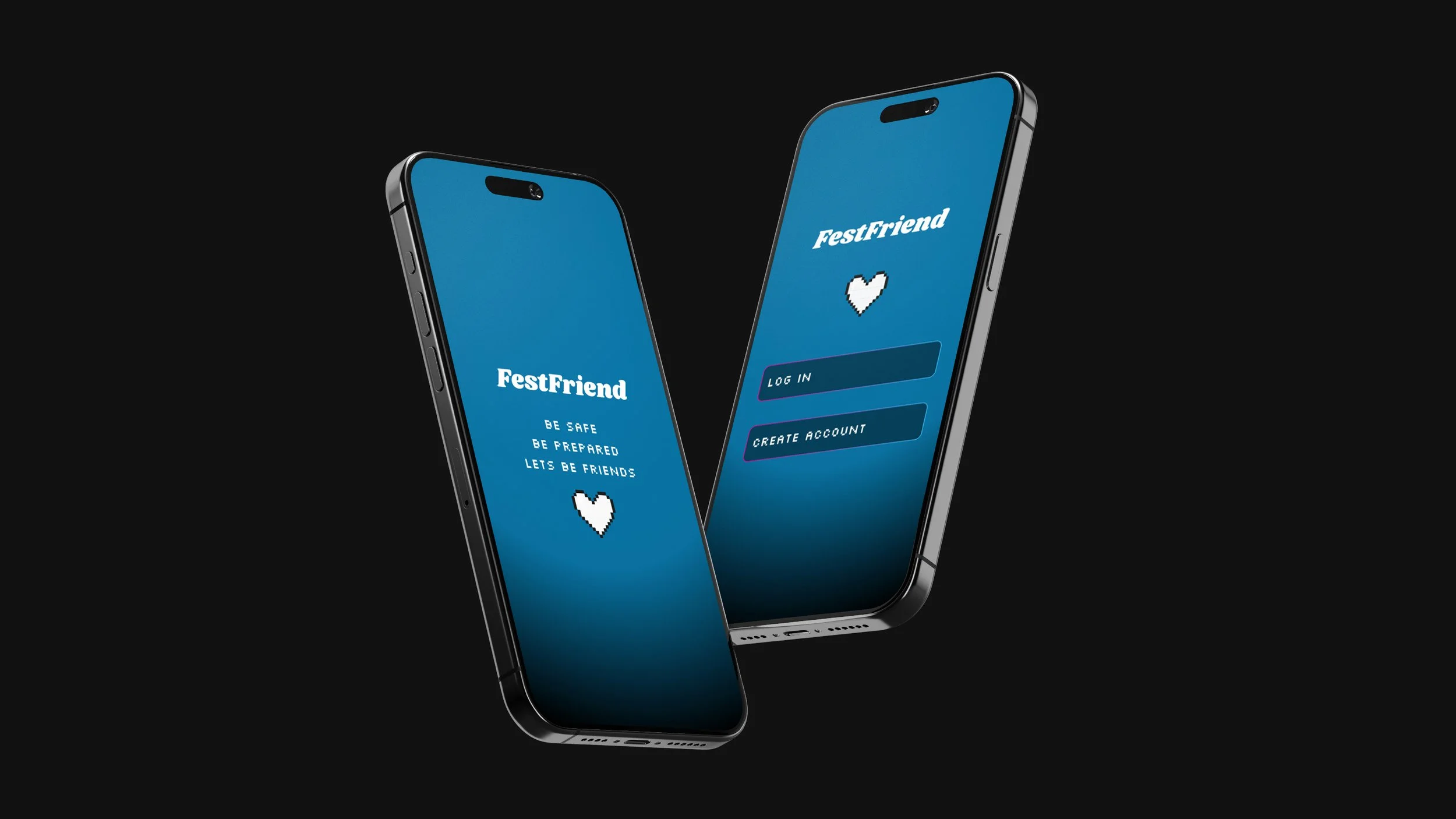
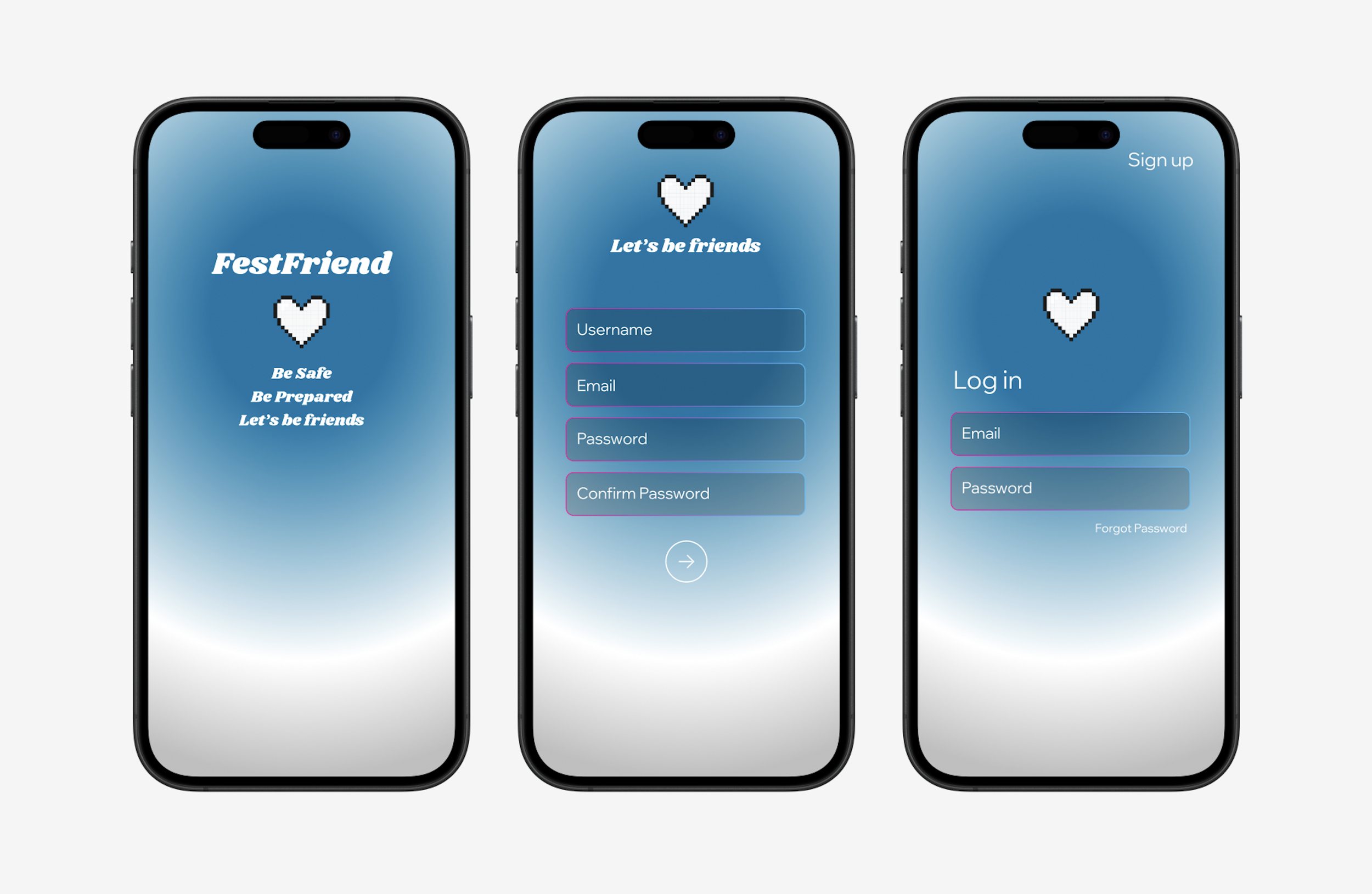
Login
These pages provide a simple, clear, and welcoming entry into FestFriend, allowing users to quickly sign in or create an account with ease.

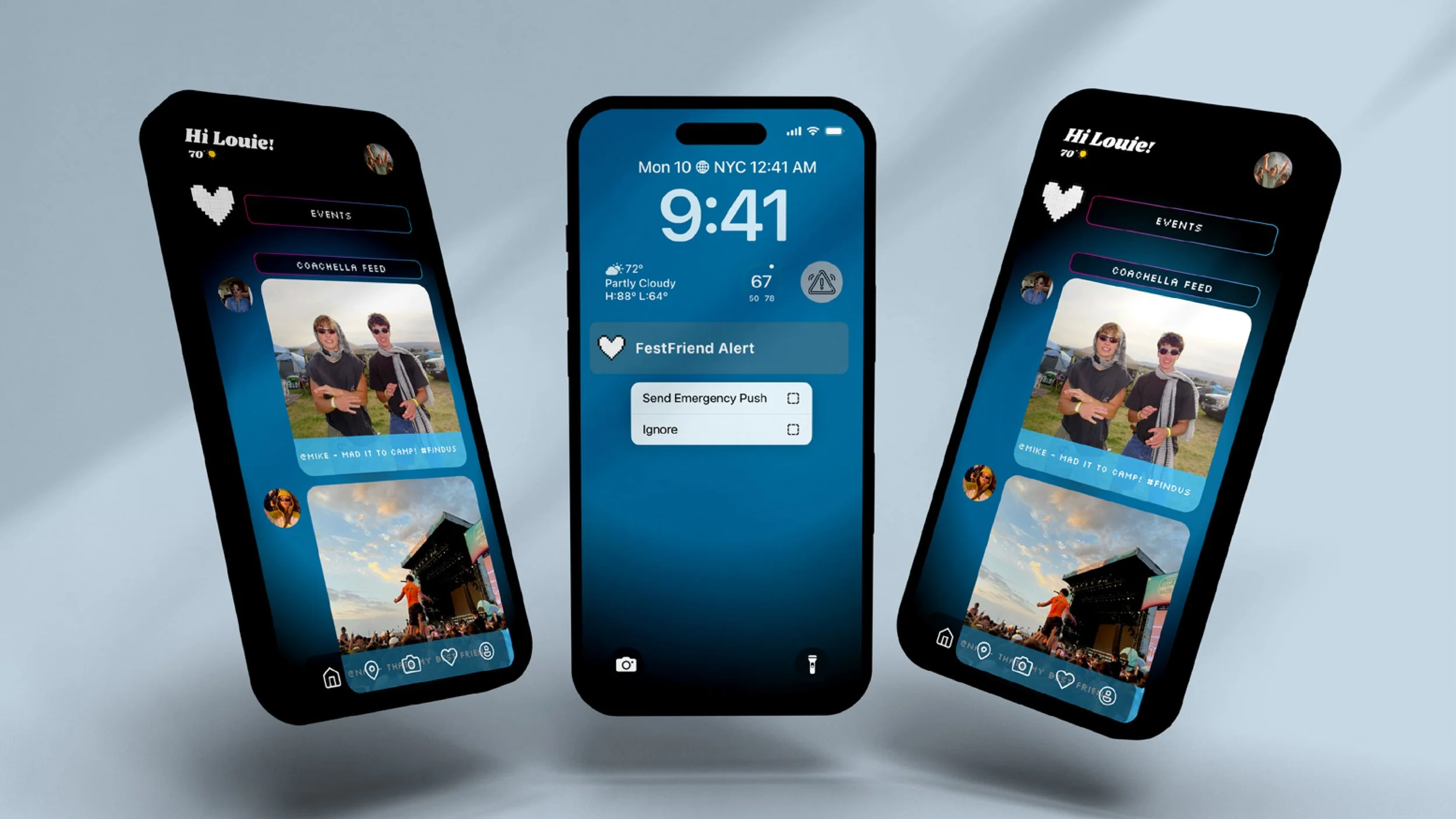
Lockscreen
The lockscreen keeps users instantly informed with real-time notifications on friends’ locations and meetup activity, ensuring they stay connected without opening the app.
Calendar
The calendar lets users easily add and manage festival events with a clean, color-coded layout. Designed for quick navigation, it keeps schedules organized and enhances the overall festival experience.

Home, Add Friends & Profile
The home, profile, and friend features were designed to make staying connected at festivals simple and personal. Users can see upcoming events, track friend activity, and share memories, all within a clean, engaging interface that balances usability with individuality.