TESTOSTERONE TONIC Subversive Branding & Satire
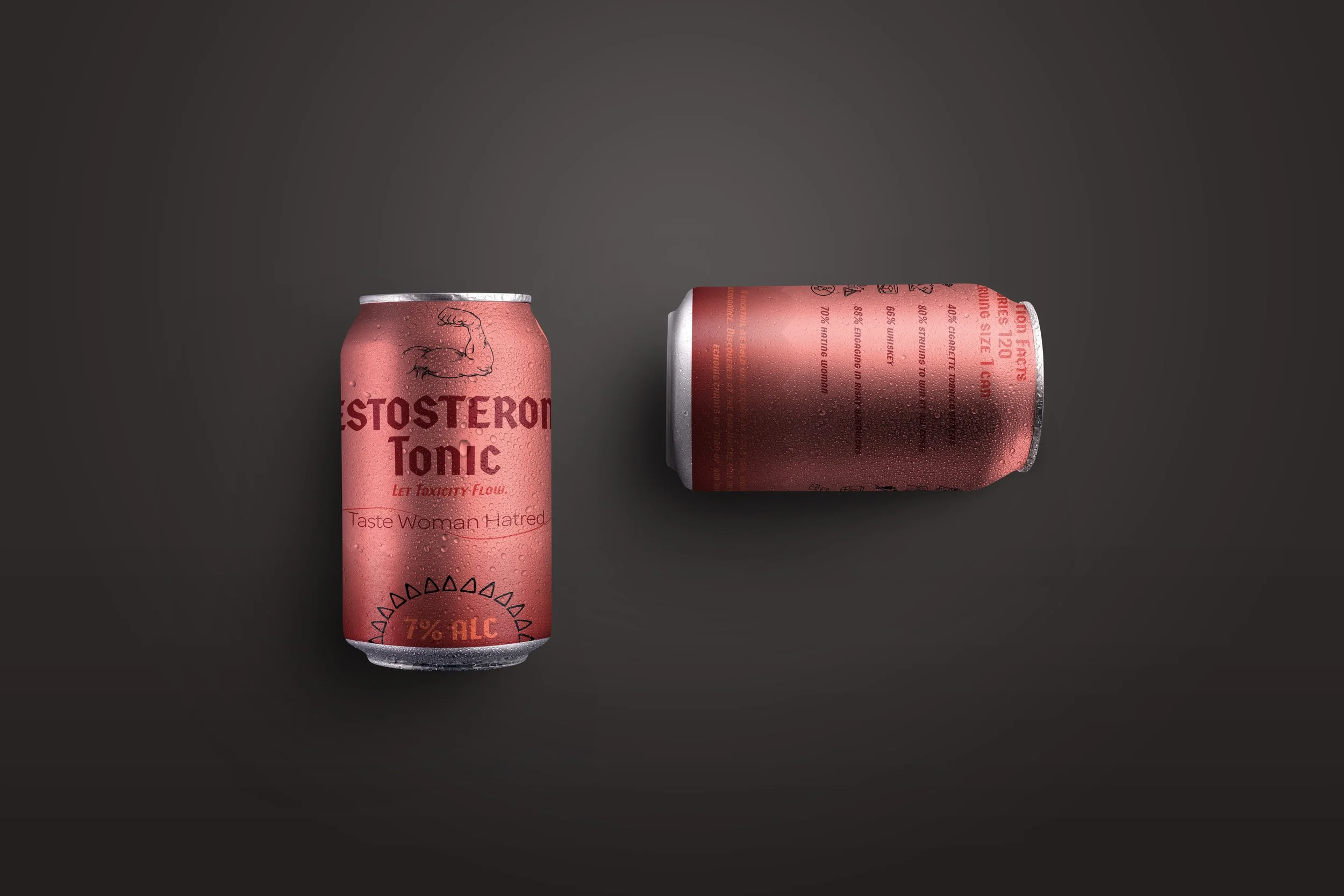
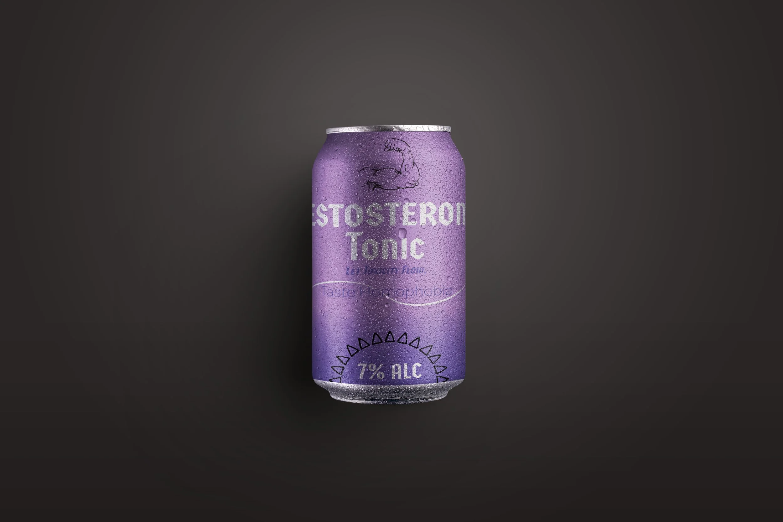
The Project Testosterone Tonic is a self-initiated, conceptual branding project created to explore the intersection of propaganda-inspired design and modern consumerism. The brand serves as a satirical critique of toxic masculinity, transforming harmful social stereotypes into a line of eight distinct beverage "flavors." The goal was to demonstrate how high-level branding and humor can be used to challenge cultural norms and spark public conversation.
The Creative Challenge The primary challenge was to develop a brand that looked "premium" enough to be real, while maintaining a sharp, satirical edge. I acted as the sole Creative Director and Designer, managing everything from the initial conceptual ideation and naming conventions to the final packaging design and typographic systems.
The Design System
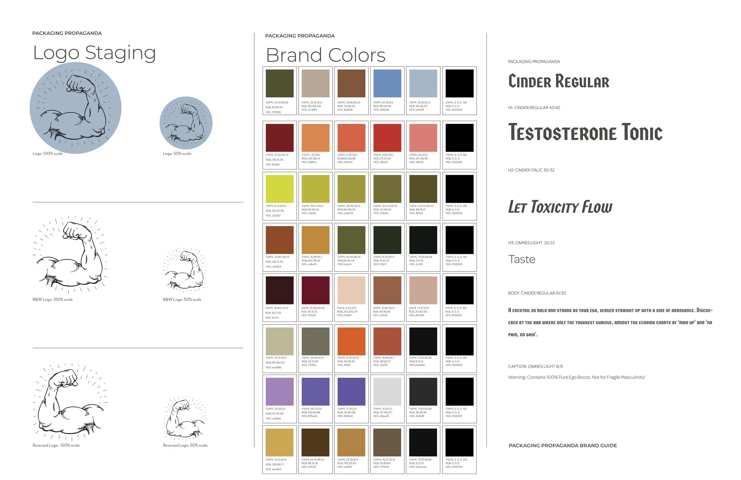
Strategic Typography I selected Cinder Regular for its structured, industrial weight to represent rigid masculine ideals. This is contrasted by Cinder Italic, symbolizing the "performance" and vanity often found in gendered marketing. Omnes Light was integrated to provide a softer, modern counterpoint, signaling the brand's underlying satirical nature.
The "Bruised" Palette I developed a color system rooted in earthy tones and industrial metals to convey "grit." I used aggressive Red and Muted Yellow accents to reflect ego and high energy, creating a visual harmony that feels both confident and tense.
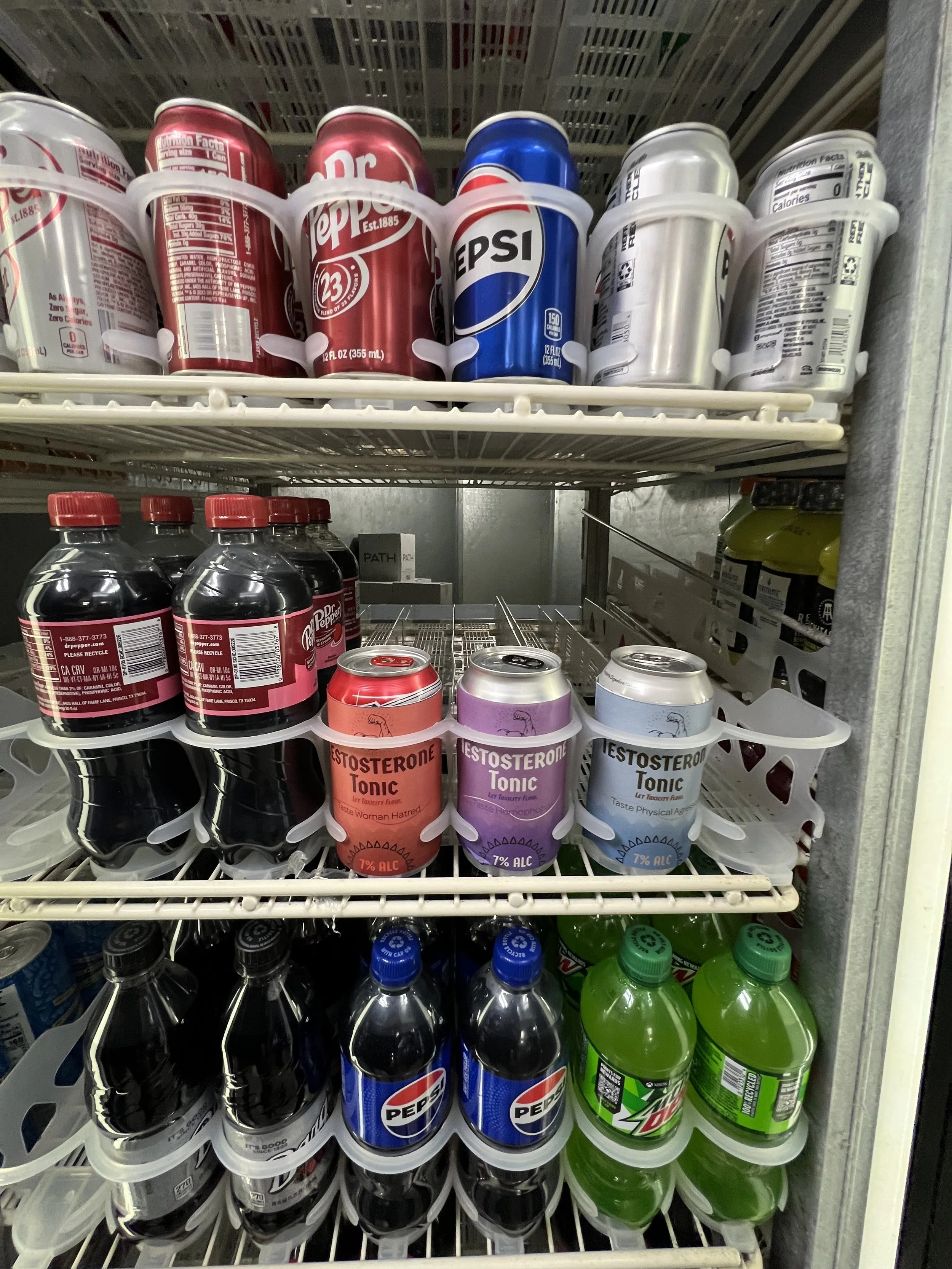
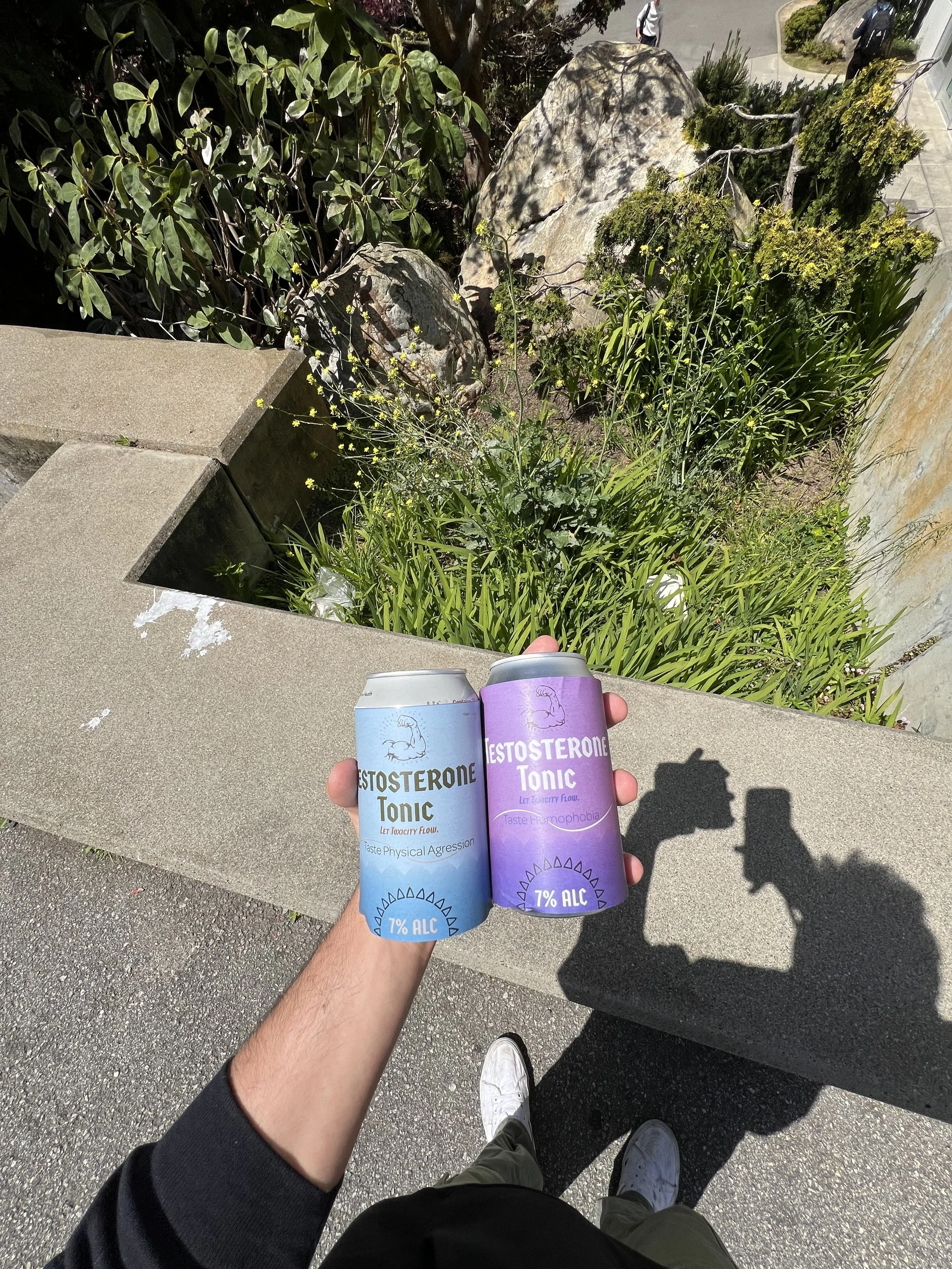
Complex Brand Architecture To prove the scalability of the concept, I expanded the brand across eight unique flavors. Each required a specific visual sub-identity while remaining anchored to the parent brand’s "Propaganda" aesthetic.
Key Contributions
End-to-End Brand Identity Developed the full visual ecosystem, including logo marks, color theory, and tone-of-voice guidelines.
Packaging & 3D Visualization Designed all label systems and executed 3D bottle mockups to visualize the product in a retail environment.
Conceptual Storytelling Researched and authored the satirical copy and flavor profiles, ensuring the social commentary remained cohesive and impactful.
Technical Toolkit: Brand Identity Development • Packaging Design • Visual Storytelling • Typography Systems • Conceptual Ideation
Core Takeaways
Design as a Social Tool This project reinforced my belief that design is not just about aesthetics; it is a powerful medium for social critique and behavioral observation.
Managing Brand Complexity Developing an eight-flavor product line taught me how to maintain strict brand consistency while allowing for creative variation across a single system.
Solo Ownership Handling every stage of the creative process—from the "big idea" to the final pixel—sharpened my ability to align a high-concept message with a professional-grade visual output.
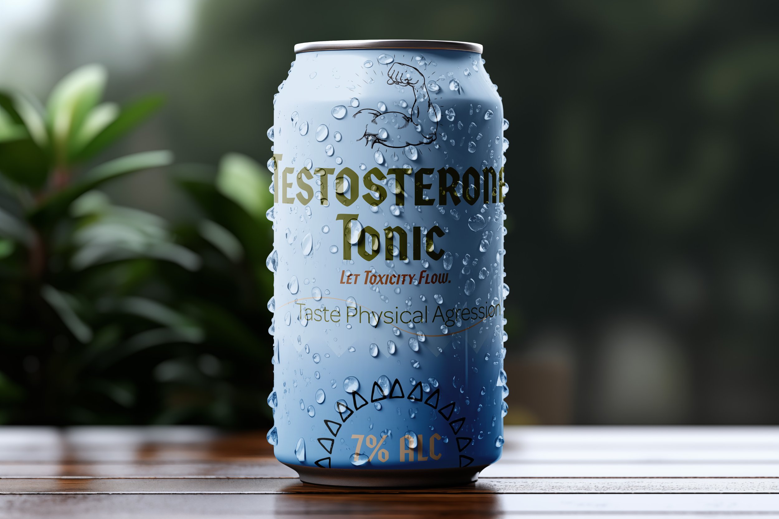
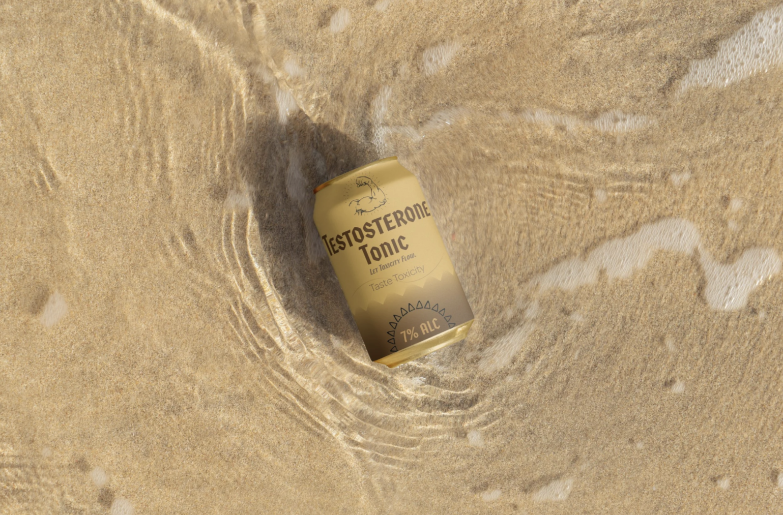

Mockups