THE BEEHIVE
Visual Identity & Brand System
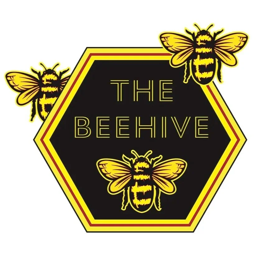
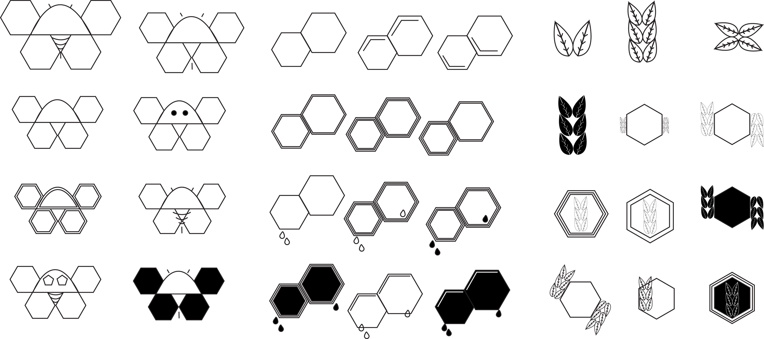
Logo Development
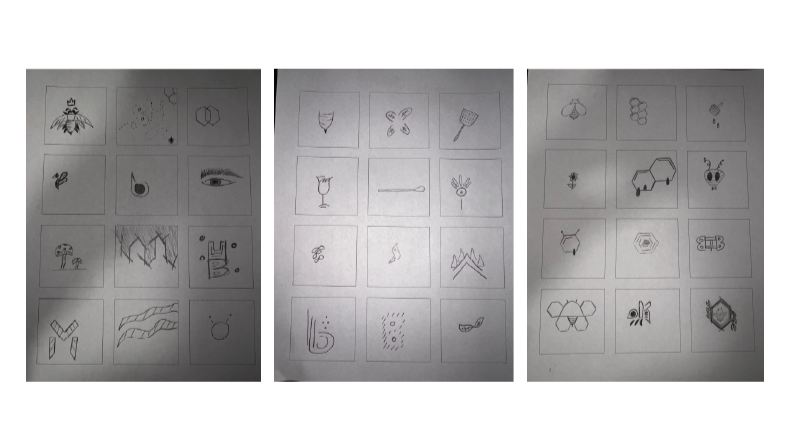
Over 40 logotypes were initially sketched. From there, 15 were refined into cleaner sketches, and 3 were identified as finalists.
Capturing San Francisco’s Eclectic Cocktail Culture
The Vision The Beehive is more than a bar; it’s a high-energy social hub in the heart of San Francisco. The goal for this project was to create a "Vibrant & Playful" brand identity that mirrored the bar’s 1960s-inspired, mid-century modern aesthetic while maintaining a contemporary, bold edge.
The Challenge The Mission District is a competitive landscape for hospitality. The Beehive needed an identity that felt established yet energetic—something that looked as good on a premium cocktail menu as it did on a casual cotton tote bag.
Project Details
Role: Lead Brand Designer & Identity Strategist
Location: San Francisco, CA
Focus: Logo Development, Color Theory, Collateral Design
Strategic Execution
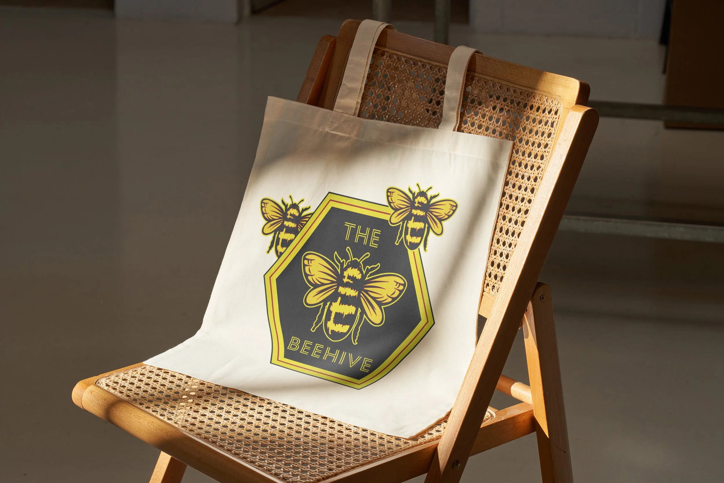
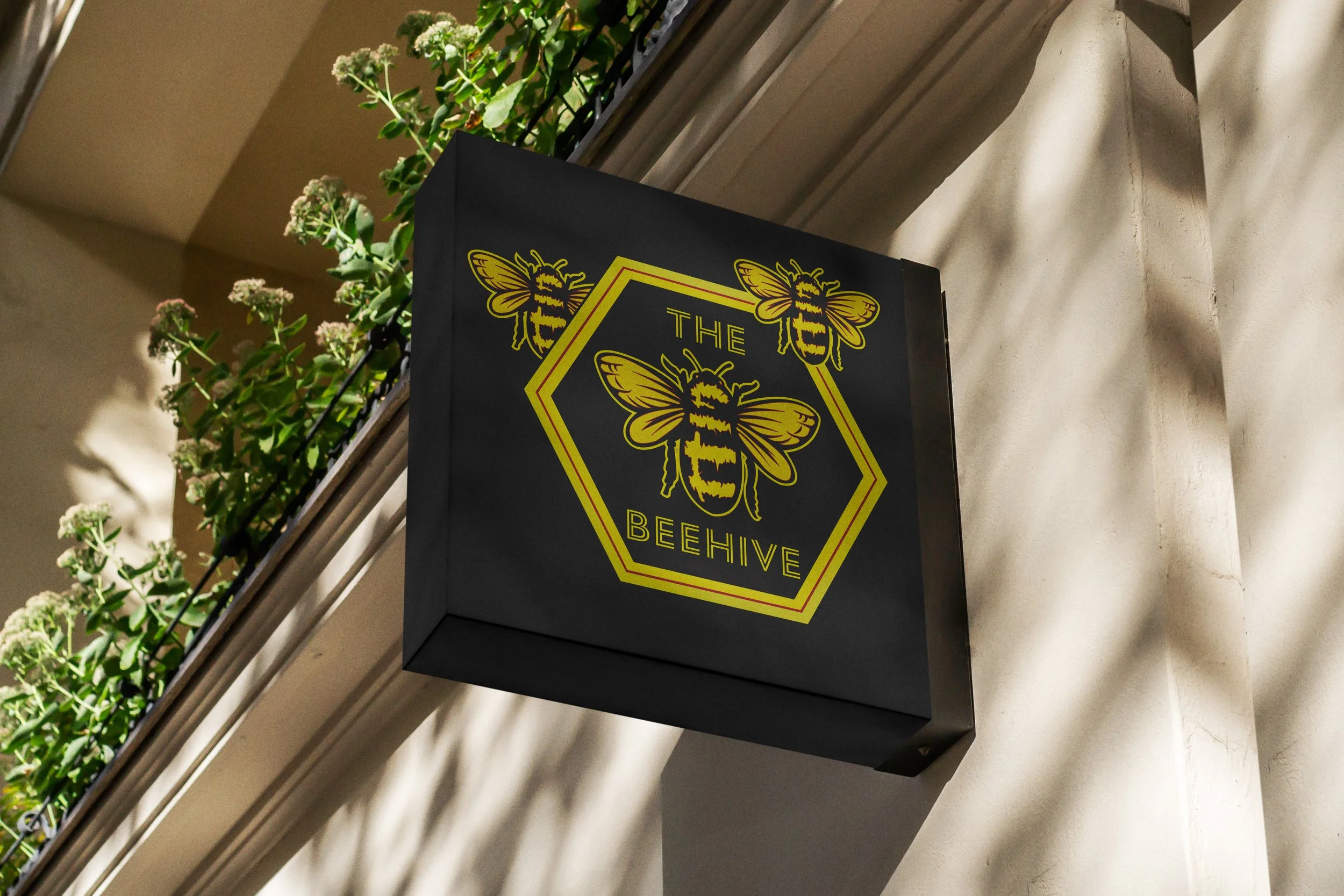
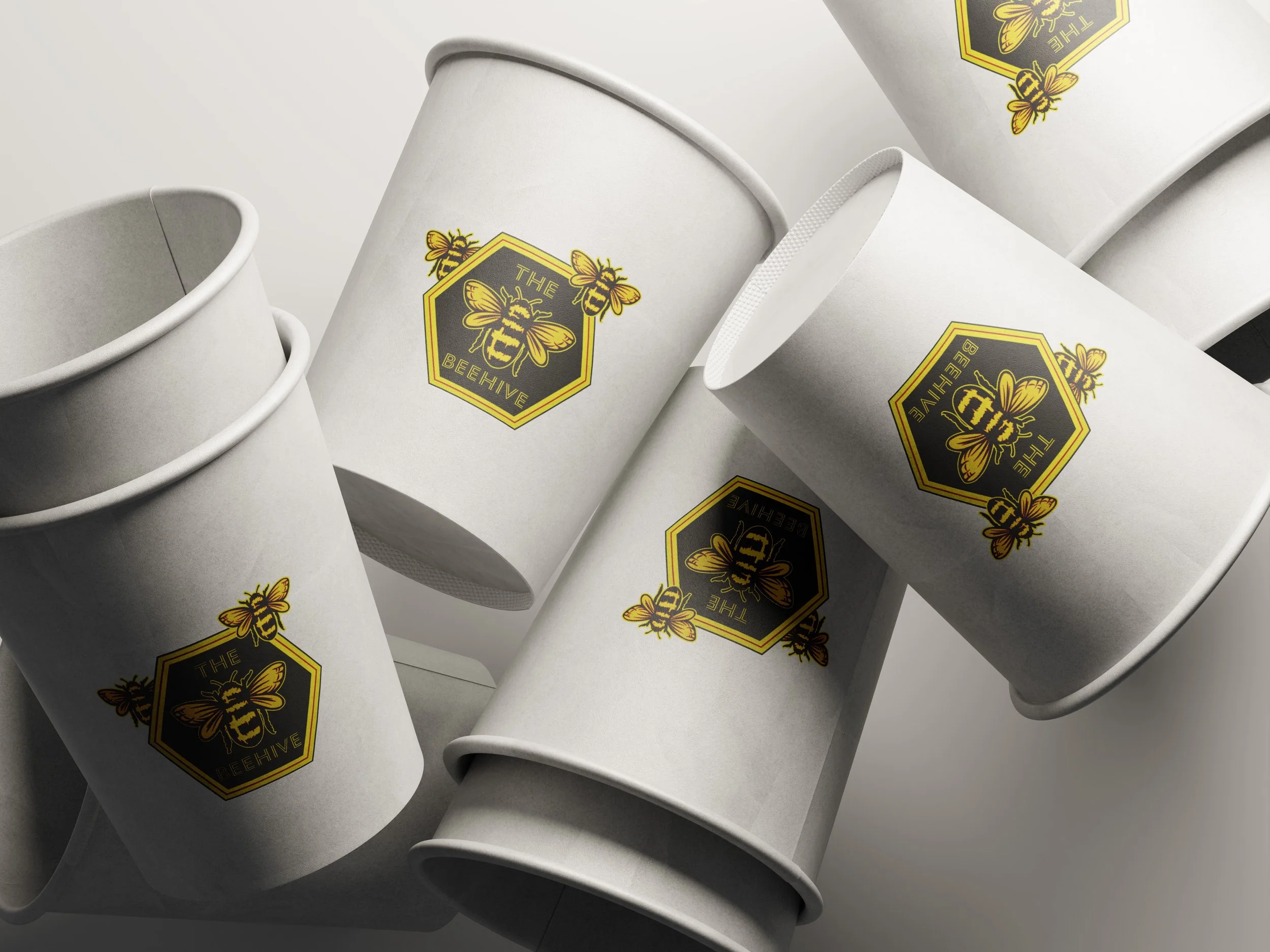
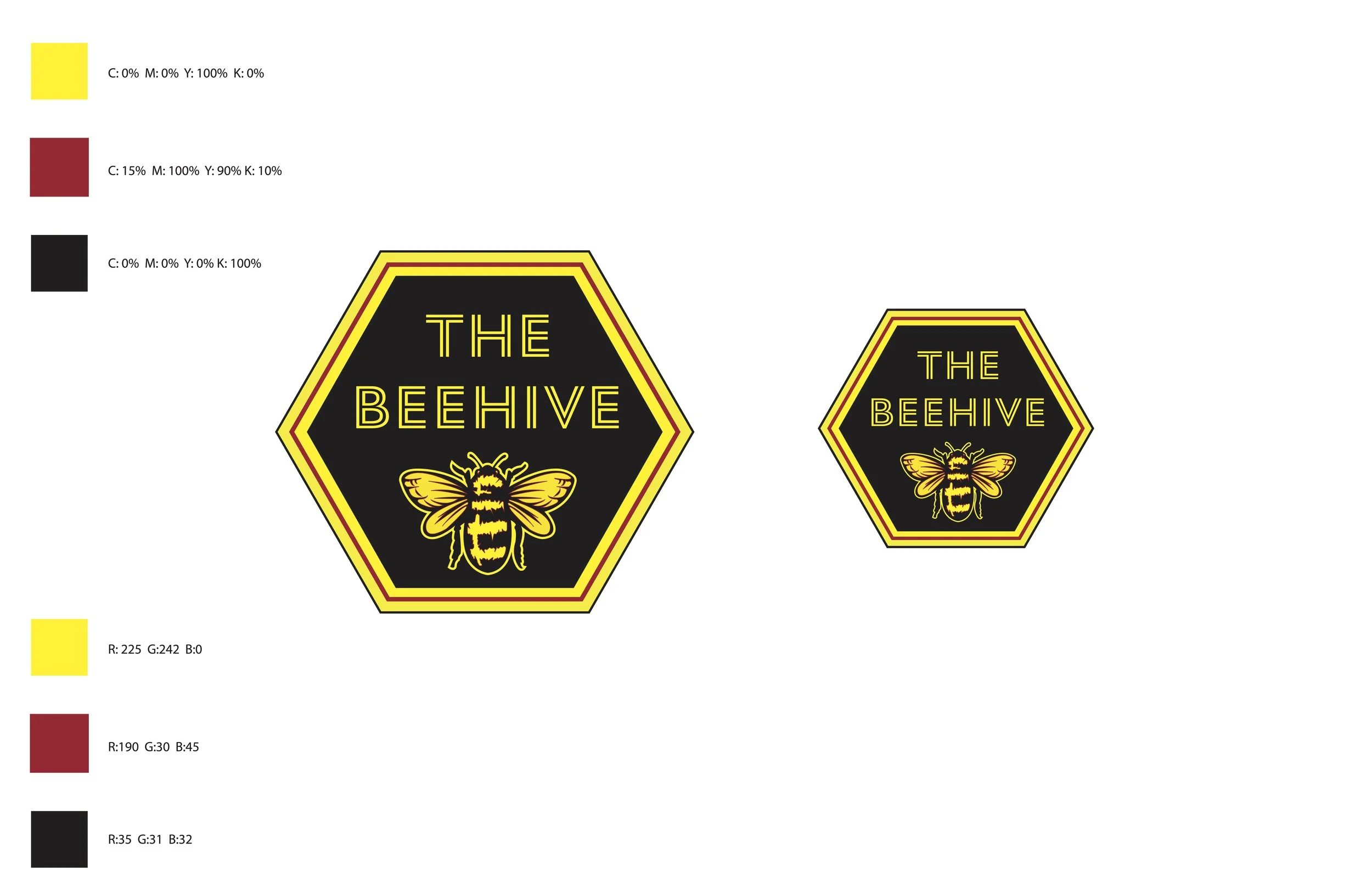
1. Custom Logo Development We developed a custom wordmark that balances retro-mod curves with clean, modern geometry. The logo was designed for scalability, ensuring it remains legible whether it's etched into a small cocktail glass or printed on a large-scale exterior sign.
2. A "Stinging" Color Palette We moved away from traditional "honey" yellows and leaned into a high-saturation palette of deep ambers, honeycomb golds, and contrasting teals. This combination drives appetite appeal while ensuring the brand stands out in low-light bar environments.
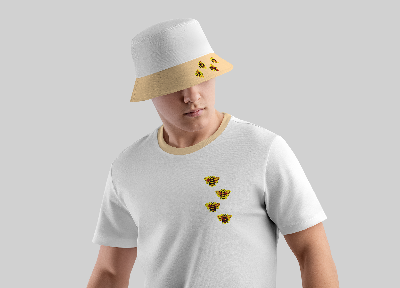
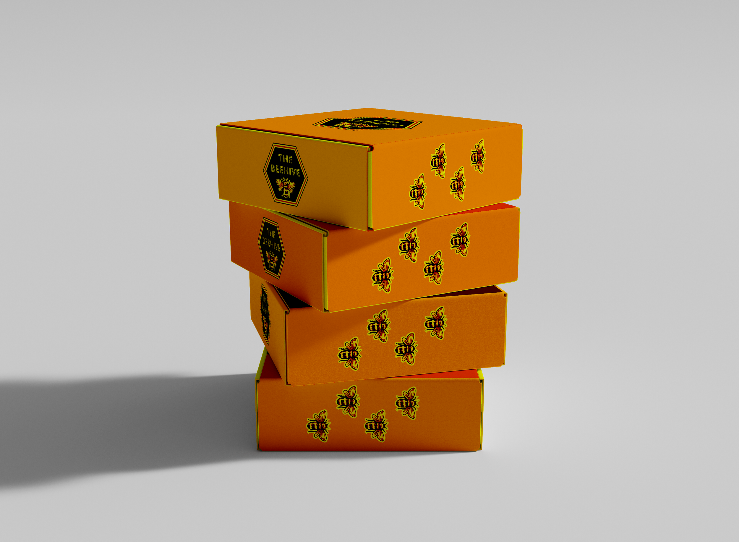
3. 360-Degree Brand Application A brand lives in the hands of the customer. We extended the visual language across multiple touchpoints to create a cohesive experiential loop:
Physical Assets: Custom-branded eco-friendly cups.
Merchandise: Bold, graphic tote bags designed to turn customers into walking brand ambassadors.
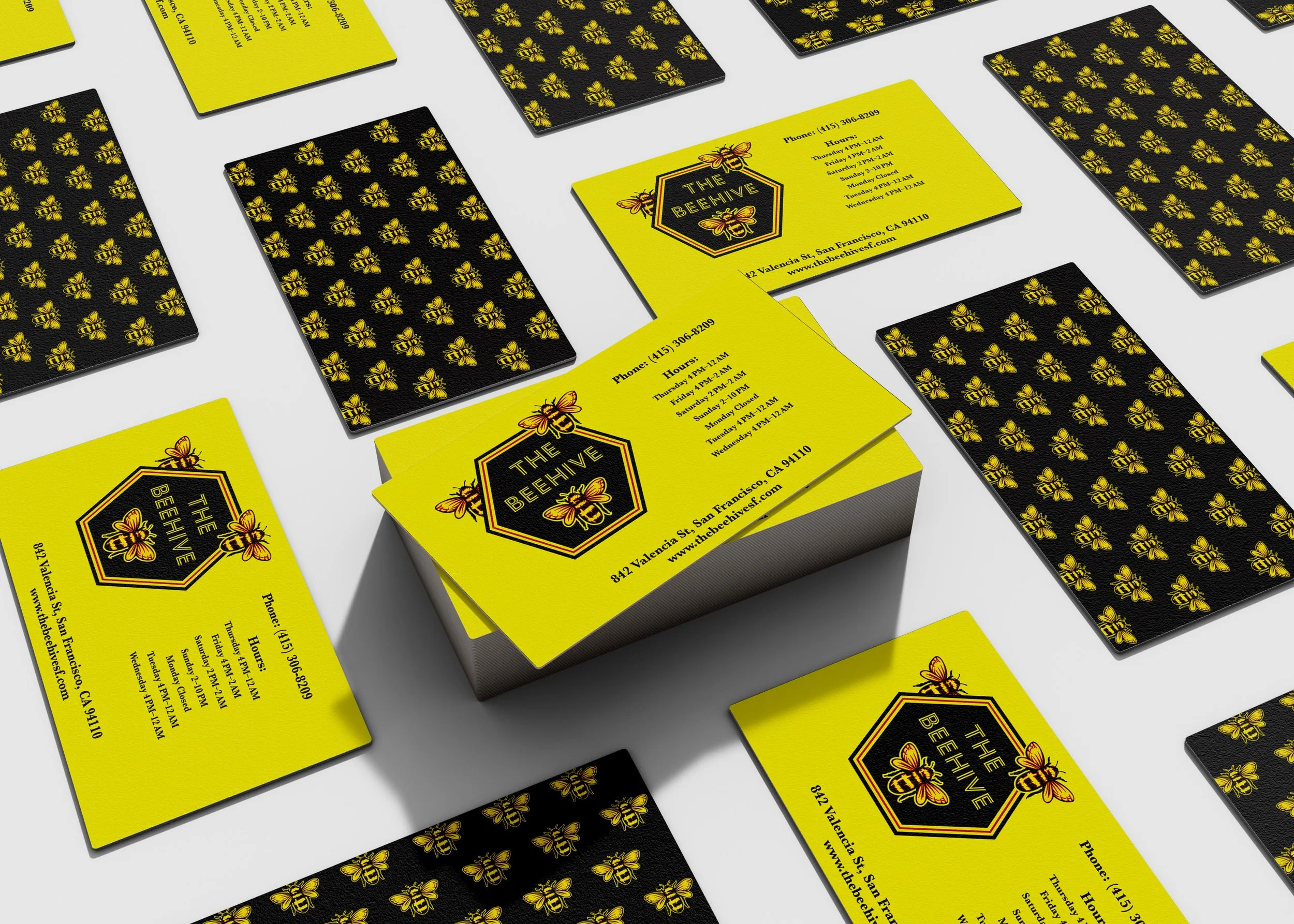
Wayfinding: High-impact business cards and signage that reinforce the bar’s "energetic atmosphere."
Key Contributions
Brand Systems Thinking Developed a flexible identity that adapts seamlessly between digital social assets and physical print collateral.
Material Selection Advised on textures and finishes for business cards and signage to ensure the "feel" of the brand matched the visual energy.
Graphic Production Executed final print-ready files for a wide variety of promotional assets, managing the transition from screen to physical product.
Core Takeaways
Identity as Atmosphere In the hospitality industry, the brand is the decor. The Beehive’s identity doesn't just represent the bar; it contributes to the "vibe" that guests come to experience.
Consistency is Key By maintaining a strict color and typographic system across everything from cups to totes, we built a brand that feels premium and intentional.
Design for Longevity A great bar brand should feel timeless. By blending 60s inspiration with modern bold lines, we created an identity that can grow with the business.